
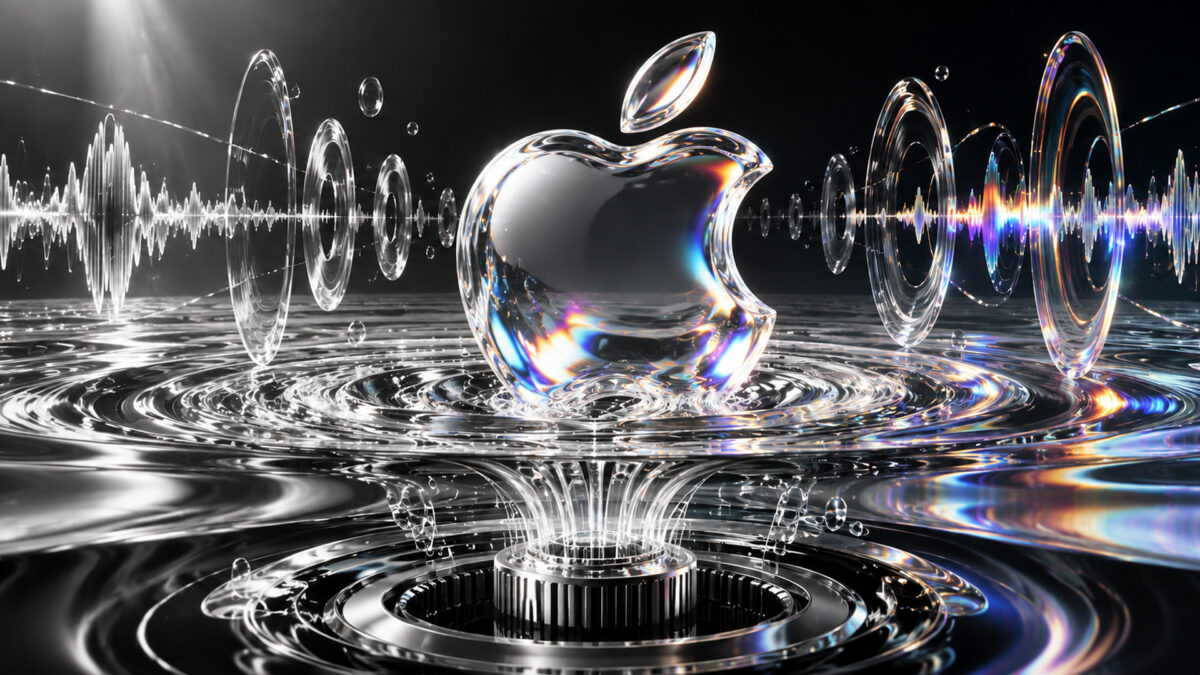
Apple Music has unveiled a new brand identity that turns sound into a visual experience, introducing a redesigned logo, an updated wordmark and a distinctive sonic signature. Built around the idea “Made by Sound”, the rebrand places music at the centre of how the streaming service looks, moves and presents itself across its platforms.
Announced on October 21, the refreshed identity was developed in collaboration with TBWA\Media Arts Lab, British music producer Fred Again.. and sound design company NEST Acoustics. Rather than beginning with conventional graphic design, the team experimented with the physical effects of sound to create visuals shaped by musical frequencies.
The result is a new visual language featuring fluid movements, ripples and shifting patterns inspired by the way sound makes liquid vibrate. Apple Music has also updated its music note symbol and wordmark, giving the service a more distinctive identity while retaining its connection to Apple’s wider design approach.
The creative process began with a simple question: what would happen if sound itself determined the appearance of a brand? To explore the idea, the team used a transducer, a device that converts audio signals into physical vibrations, to play musical frequencies through a shallow bath of mineral oil.
As the sound travelled through the liquid, it created waves and ripples that changed the way light moved across objects placed in the bath. The team filmed these effects and used the resulting footage as the foundation for Apple Music’s new visual identity.
Mineral oil was chosen for its ability to create smooth, glass-like movements and striking light refractions. Acrylic versions of the music note logo and wordmark were placed in the liquid, allowing the vibrations to shape the images captured on camera.
The process required extensive experimentation with different notes, frequencies and materials. The team had to find a balance between movement and clarity so that the resulting visuals remained recognisable as the Apple Music logo. The final design was developed over several months of creative and technical work.
Music producer Fred Again.. and his collaborator NEST Acoustics helped create the original composition that serves as the brand’s new sonic signature. Individual notes from the composition were used to generate the liquid movements seen in the accompanying film, connecting the audio and visual elements of the identity.
The new wordmark pairs the Apple symbol with a customised version of the company’s SF Pro typeface. Its bold, lowercase lettering gives Apple Music a more expressive appearance, while the redesigned musical note draws on the fluid shapes captured during the physical experiment.
The visual direction also connects with Apple’s Liquid Glass design language, which uses transparency, reflections and layered visual effects across its software ecosystem. However, Apple Music’s identity has its own music-led character, using sound waves and liquid movement to create a look associated specifically with the streaming service.
The rebrand follows the appearance of a new Apple Music app icon in software beta versions earlier this month. The redesigned icon moves away from the previous red colour scheme towards a simpler black-and-white treatment. The wider identity introduces more expressive visuals for promotional content, artist programming and brand experiences.
Apple Music first offered a glimpse of the new wordmark in September, when it promoted Apple Music Hall, its new live entertainment venue in London. The company has now formally introduced the identity and released a behind-the-scenes film explaining how the design was created.
The new branding is expected to appear across Apple Music’s original content and event programming, followed by a broader rollout across marketing, products and other brand experiences. The updated app icon and related software changes are also expected to reach users through upcoming Apple software releases.
The redesign is more than a logo change. Streaming services compete not only through their music catalogues and subscription offerings but also through their relationships with artists, listeners and cultural events. A recognisable visual and audio identity can help a service stand out in a crowded market.
The “Made by Sound” concept attempts to make that identity tangible by showing how music can create physical movement. Instead of simply using abstract graphics to represent sound, the company has used the effects of actual vibrations to shape its branding.
The approach gives Apple Music a consistent creative idea that can extend from its app and advertising to original programming and live experiences. Its success will depend on how effectively the identity translates across these settings and becomes recognisable to listeners.
With its redesigned logo, new wordmark and original sonic signature, Apple Music is placing sound at the heart of its brand. The rollout will show how this experimental approach works across the everyday experiences of people using the service.